Some spaces don’t just welcome you, they shift something within.
The Scarlet Tusk is one such space. This coaching academy in Pune redefines what commercial interior design can be: calm, bold, and deeply intentional. From the first step inside, the atmosphere speaks without noise.
Ever wondered what happens when an elephant becomes your guide, a key unlocks more than doors, and every colour choice has a purpose? Let’s explore how Sparc Design transformed this coaching academy into something extraordinary.
The Scarlet Tusk: A Canvas for Aspiring Minds
At Sparc Design, we believe interior design for commercial spaces should inspire before they educate. The Scarlet Tusk, our 1200 sq. ft. coaching academy in Pune, masterfully combines color psychology, innovative lighting, and contemporary design. Here, CA, CS, and Law students experience commercial interior design that builds emotion, not just function. Bold hues, thoughtful illumination, and meaningful symbolism create an environment where learning transcends the ordinary.
Let’s unlock every detail and unfold all the layers.
The Symbol That Started It All
Some symbols speak louder than words.
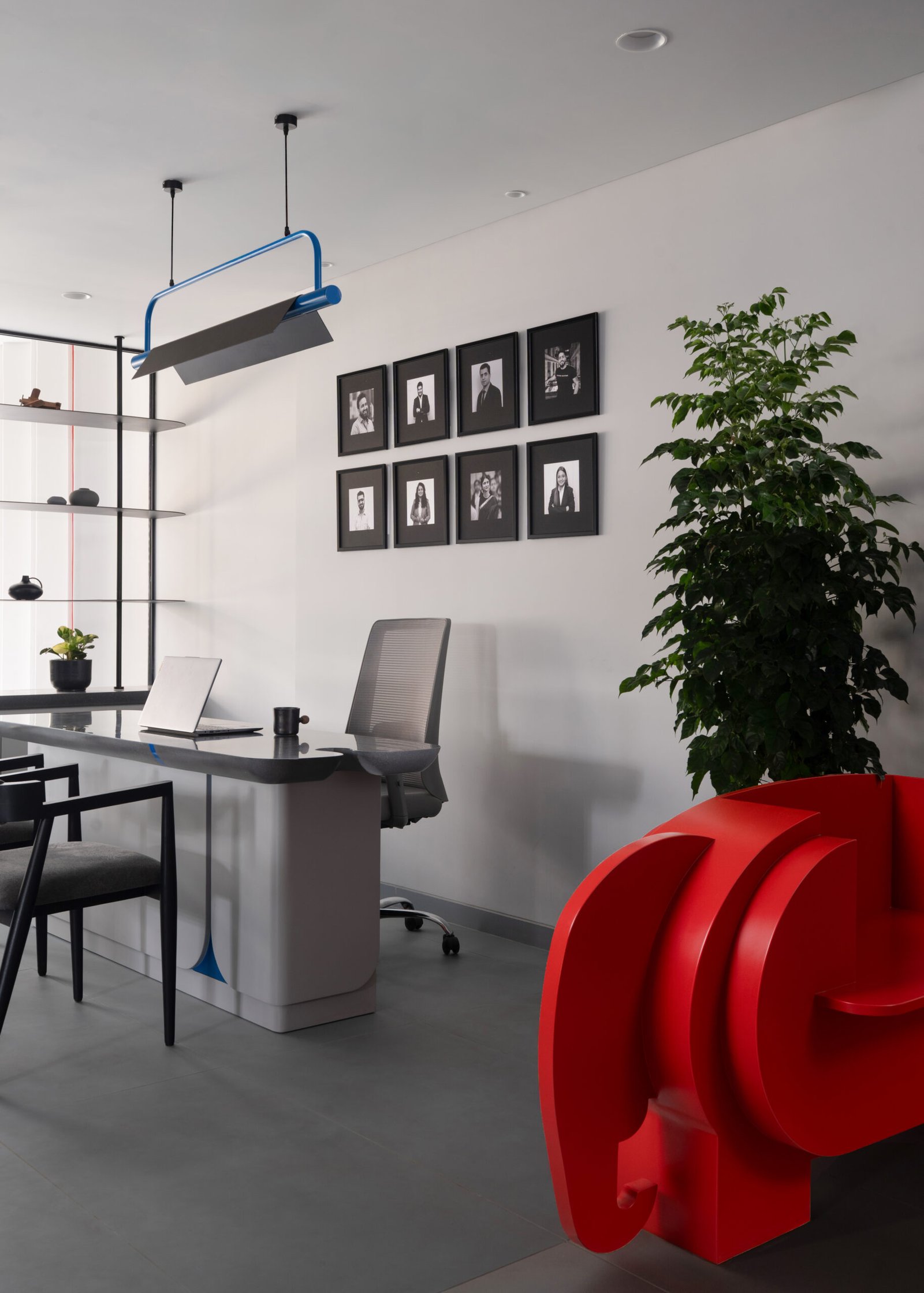
In this space, the scarlet elephant doesn’t just sit at the entrance; it sets the tone. A presence of calm strength, grounded wisdom, and quiet resilience, it becomes more than a sculpture, more than a seat.
It anchors the academy in purpose, reflecting a design philosophy where every element holds meaning. The elephant motif is woven throughout the entire space, appearing on internal partitions, washroom cabinetry, and furniture details. It’s a masterful example of how commercial interior design trends are moving toward meaningful symbolism that resonates emotionally with users.
The Key to Everything
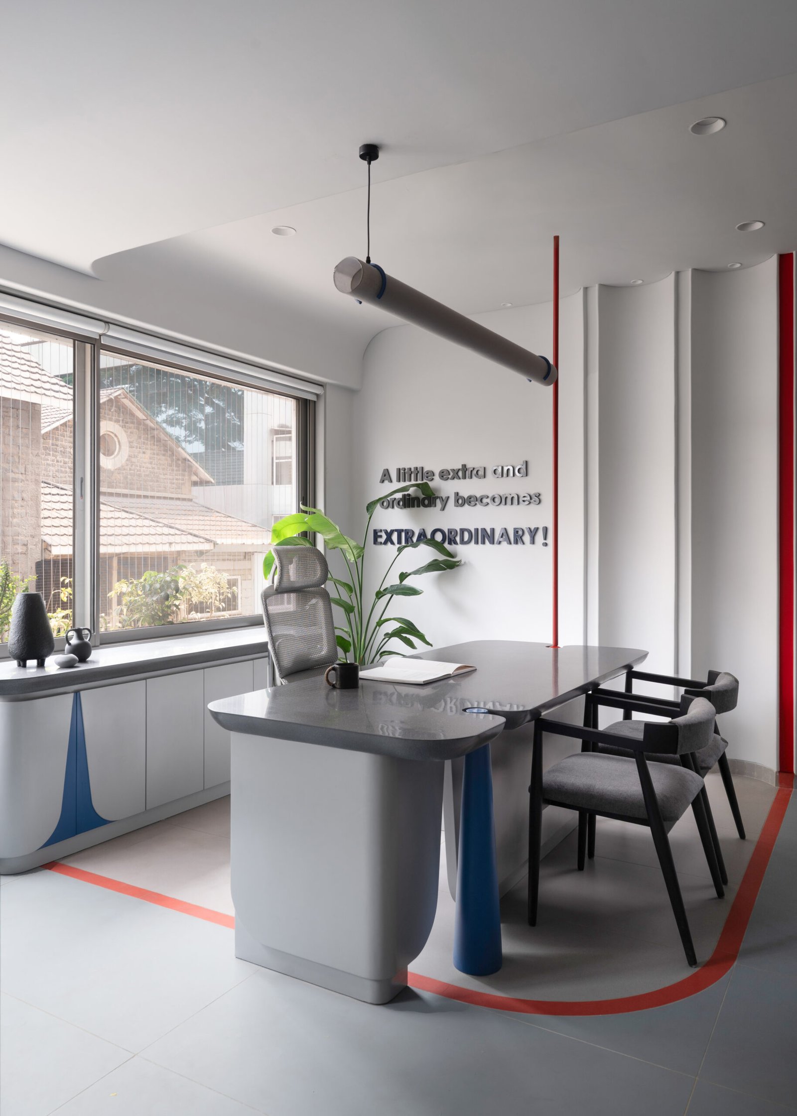
That key you notice? It isn’t just a shape, it’s a reminder.
The Scarlet Tusk is a coaching academy that unlocks confidence, clarity, and direction.
It became the thread tying the space together. In this interior design for commercial spaces, every surface, fixture, and detail echoes the academy’s role in guiding students toward clarity, confidence, and purpose.
This recurring key concept manifests in custom murals that inspire, lighting fixtures that illuminate ambition, furniture design that reinforces the brand story, and floor patterns that guide movement and focus. This key creates a cohesive narrative that students encounter at every turn, transforming ordinary study sessions into purposeful journeys toward professional success.
When Lighting Becomes Storytelling
Ever wondered how lighting can tell a complete story? The lighting strategy at The Scarlet Tusk exemplifies how commercial interior design can elevate functional elements into design statements. Each fixture serves multiple purposes, providing practical illumination, creating a visual rhythm, and reinforcing the narrative.
Lighting That Speaks Volumes:
- Soft, fabric-wrapped lights set the tone with a gentle, inviting glow, perfect for long hours of focus without fatigue.
- Blue loop lights weave their way through the space, tying everything together with rhythm and flow.
- Bold red verticals aren’t just holding things up; they’re anchoring the space’s identity with a powerful presence.
- And then, surprise! Horizontal red pipes that seem purely functional suddenly double as lighting. A quiet “wow” moment.
- Key-shaped matte black fixtures almost disappear… until electric blue pipes slice through, turning up the visual drama.
- The show-stealer? Custom red task lights that cleverly carry the key motif. Lighting that doesn’t just perform; it tells a story.
Every fixture here does more than just light up a space; it guides, connects, surprises, and reinforces the coaching academy’s core promise. It’s lighting with a voice, and it’s speaking fluently in design.
The Psychology of Colours in Commercial Interior Design
Colour quietly shapes how people feel, focus, and behave. At The Scarlet Tusk, each shade is carefully selected, reinforcing purpose and enhancing the experience. This approach reflects a deeper understanding of current commercial interior design trends that prioritise mood, clarity, and function.
- Grey forms the base. It brings a sense of calm and balance, creating an environment that supports focus and sustained attention.
- Blue is used in high-focus zones to promote clarity and trust. It helps maintain calm in high-pressure moments while suggesting innovation and connection.
- Scarlet red adds a layer of energy. It activates the space, sparks creativity, and draws attention to key elements without overwhelming them.
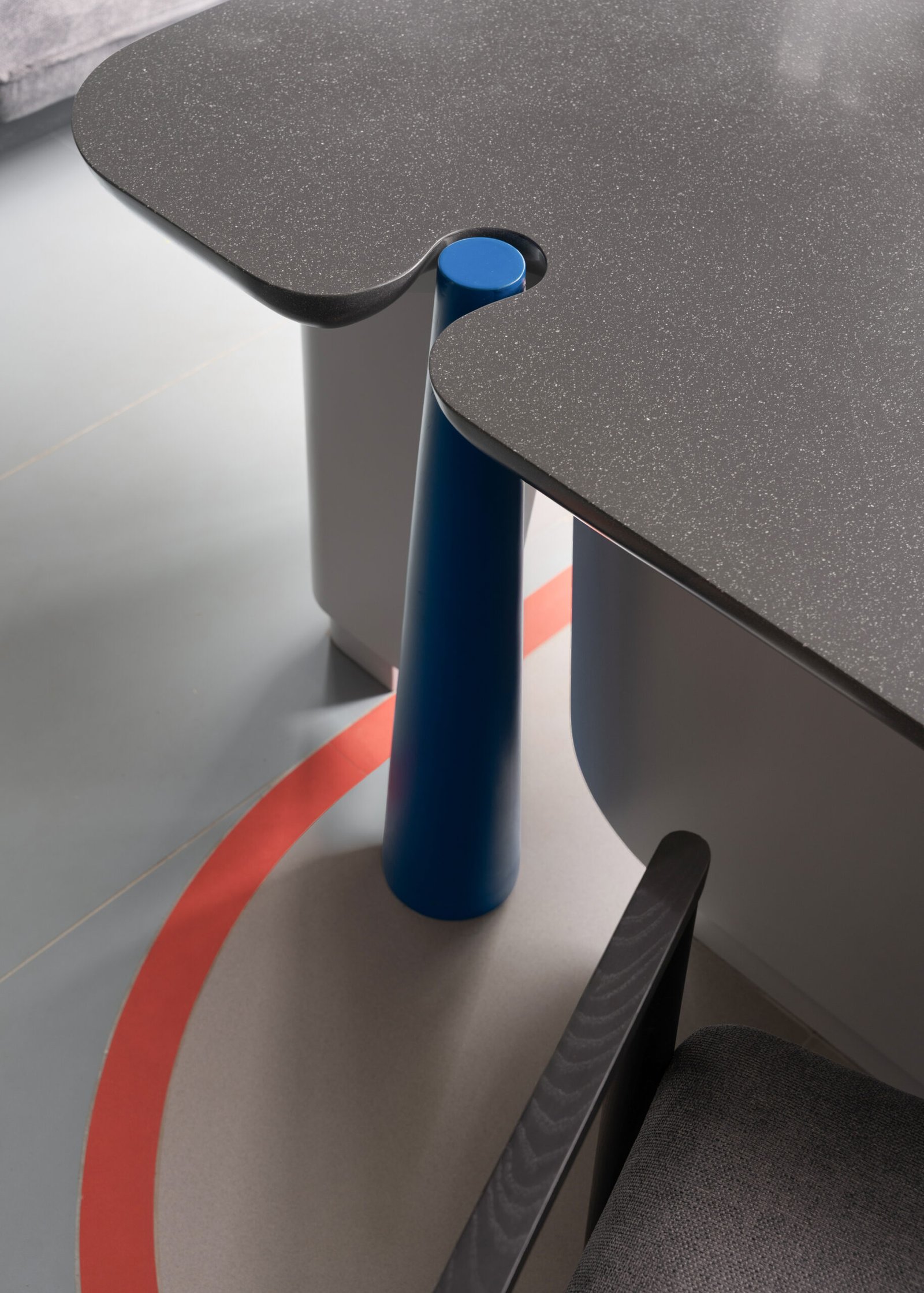
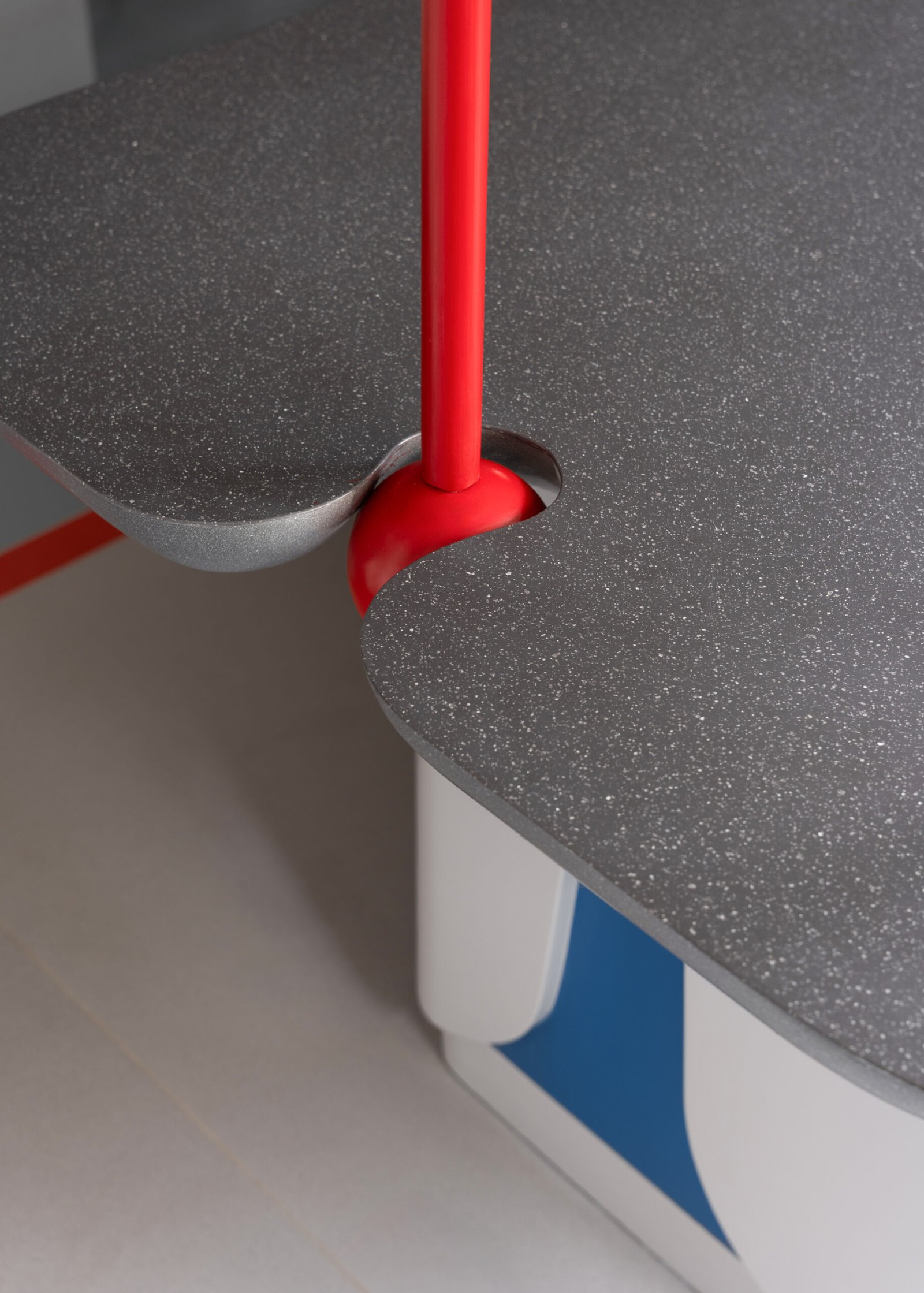
In this commercial interior design, colour is also integrated into functional design. Red cabinet handles in the teachers’ cabin maintain visual continuity, while the keyhole shape is also featured in table separators and cabinet panels. This limited palette creates strong visual interest and reflects a refined design approach that values intention over excess.
Material Innovation and Craftsmanship
The project showcases how interior design for commercial spaces can balance durability with aesthetic appeal. Every material choice serves both function and story, demonstrating the evolution of commercial interior design trends toward meaningful, multi-purpose elements.
The keyhole shape transforms into multiple functional elements throughout the space:
- Table separators in collaborative areas that add visual interest
- Cabinet fascia details that reinforce brand identity
- Architectural elements that multiply design impact
This innovative approach demonstrates how a single design concept can multiply its impact through thoughtful application across different scales and functions.
Creating A Deep Emotional Connection
Beyond aesthetics, The Scarlet Tusk project succeeds in creating emotional resonance. The bold red elephant sculpture becomes a gathering point, a photo opportunity, and a conversation starter. Students don’t just study here; they connect with the space’s personality and remember their experience long after leaving.
This emotional dimension reflects the evolving commercial interior design trends that prioritise user experience and create memorable moments. The space becomes part of the educational journey, not just a container for it. Every element works to create an environment where focus, growth, clarity, and strength aren’t just concepts; they’re lived experiences.
Designing with Purpose: The Sparc Approach
The Scarlet Tusk represents Sparc Design’s commitment to creating commercial interior design solutions that transcend mere functionality. Our integrated approach ensures that every element, from the sculptural elephant bench to the custom lighting fixtures, serves the client’s broader mission of educational excellence.
At Sparc Design, we understand that effective commercial interiors must balance multiple objectives: brand expression, functional efficiency, and user experience. The Scarlet Tusk coaching academy demonstrates our ability to weave these requirements into a cohesive narrative that resonates with both clients and end users. From concept to completion, we handle architecture and interiors in-house, ensuring seamless integration and meaningful design experiences.
FAQs (Frequently Asked Questions)
- What makes commercial interiors effective for educational spaces?
Effective interior design for commercial spaces balances function and inspiration, creating environments that support sustained focus, reflect institutional values, and foster deeper student engagement through thoughtful spatial planning and purposeful material and color choices.
- What design elements make The Scarlet Tusk coaching academy unique?
The Scarlet Tusk features symbolic storytelling through commercial interior design. The scarlet elephant represents wisdom, recurring key motifs symbolize unlocking potential, custom lighting enhances focus, and strategic color psychology creates an emotionally resonant learning environment.
- How do colour choices impact productivity in commercial interiors?
Color psychology significantly impacts productivity in commercial interiors. Neutral tones provide foundational calm and clarity, while strategic accent colors like blue enhance focus, red energizes creativity, and proper application matches zone-specific needs for optimal performance.
- How does The Scarlet Tusk’s design support student learning and focus?
The Scarlet Tusk’s interior design supports learning through grey base colors for mental calm, blue accents for concentration, energizing red elements, custom lighting that reduces eye strain, and symbolic design elements that create positive learning associations.
- What makes Sparc Design’s approach to commercial interior design unique?
Sparc Design blends architectural insight with interior detail, creating emotionally rich spaces that tell unique stories. By handling architecture and interiors in-house, we ensure seamless integration while developing layered design languages that subtly reinforce brand identity.